Absolutely, going light up top and dark below in your bathroom is a smart move—it creates a visually balanced space that feels both airy and grounded. This classic design trick plays with contrast to make ceilings appear higher while anchoring the room with depth and sophistication. But nailing the execution requires more than just slapping on two different paint colors. Let’s break down why this combo works and how to do it right without your bathroom looking like a DIY fail.
Our brains are wired to associate light colors with openness and dark tones with coziness. A light ceiling (think soft whites, pale blues, or creamy beiges) tricks the eye into perceiving more height, which is clutch in smaller bathrooms where low ceilings can feel claustrophobic. Meanwhile, darker lower walls—navy, charcoal, or even deep green—add weight and drama, grounding the space so it doesn’t feel like it’s floating away. It’s like wearing a crisp white tee with dark jeans: timeless, flattering, and impossible to mess up if you stick to the basics.
Picking the perfect light-dark duo isn’t just about grabbing random swatches. Undertones matter—a cool white paired with a warm espresso brown will clash harder than stripes and polka dots. Stick to colors with similar undertones (e.g., a grayish-white with a slate blue) for harmony. Pro tip: Test your top color near the ceiling and the darker shade at eye level to see how they interact in your bathroom’s lighting. Natural light can turn a moody gray into a gloomy cave or a breezy oasis, depending on the time of day.
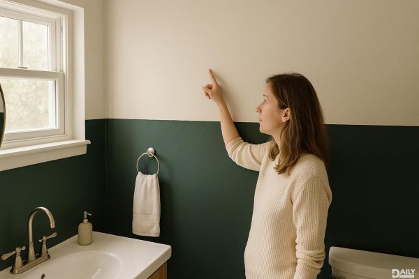
The transition between light and dark needs intentional placement. A common mistake? Stopping the dark color too low, making the room feel chopped in half. Aim for a dividing line around ⅔ of the wall height or align it with existing architectural features (like a shower ledge or wainscoting). For a seamless blend, use a satin or semi-gloss finish on both colors—matte can make the divide look harsh. If you’re extra, add a thin molding strip painted in the lighter shade to bridge the gap like a pro.
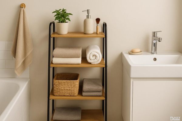
Once your walls are set, tie the look together with fixtures and decor. Brushed gold or matte black hardware pops against dark lower walls, while fluffy white towels and a statement mirror keep the upper half feeling fresh. Avoid overcrowding with too many patterns—let the color contrast be the star. Plants are your friend here; a trailing pothos or a sleek snake plant softens the transition and adds life without cluttering the vibe.
Not every bathroom needs this formula. If you’ve got soaring ceilings or a windowless dungeon, flipping the script (dark up top, light below) can work wonders. Just keep the dark ceiling shade muted—think “midnight sky” rather than “black hole”—and balance it with plenty of reflective surfaces (hello, glossy tiles). And if you’re renting? Temporary solutions like peel-and-stick wallpaper or removable panels can fake the look without landlord drama.
At the end of the day, the light-top-dark-bottom strategy is less about rules and more about creating a space that feels right for you. Whether you’re going for spa serenity or moody elegance, the key is confidence—own the contrast, and your bathroom will too.