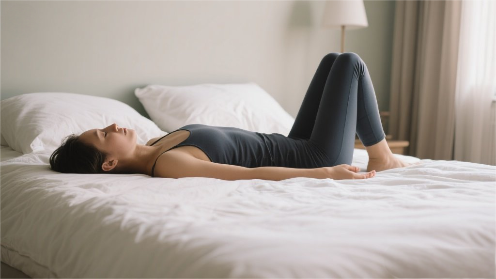
When it comes to creating a relaxing bedroom, the right paint color can make all the difference. Soft, muted tones like warm grays, soothing blues, and gentle greens are your best bet for turning your space into a sleep sanctuary. But it’s not just about picking a pretty shade—colors have a psychological impact, influencing everything from your mood to how quickly you drift off at night. So, if you’re staring at a sea of paint swatches and feeling overwhelmed, don’t sweat it. We’ve got the top picks to help you transform your bedroom into the ultimate chill zone.
Believe it or not, your brain processes color in ways that directly affect relaxation. Cooler tones like blues and greens are naturally calming because they mimic elements of nature—think serene ocean waves or a quiet forest. These hues lower heart rate and reduce stress, making them perfect for a bedroom. On the flip side, super bright or intense colors (looking at you, neon orange) can be overstimulating, keeping your mind buzzing when it should be winding down. That’s why sticking to softer, more subdued shades is key for a restful retreat.
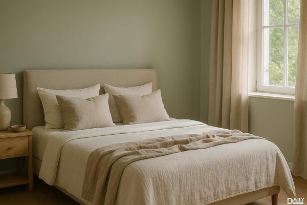
If you want a bedroom that feels like a warm hug, go for neutral tones like beige, taupe, or soft gray. These shades create a grounded, peaceful vibe without being boring. A light greige (that’s gray + beige, for the uninitiated) works wonders in small spaces, making them feel airy yet snug. For a touch of sophistication, try a deeper taupe with warm undertones—it adds just enough richness without overwhelming the room. Pair these walls with crisp white bedding and natural wood accents for a look that’s effortlessly stylish and sleep-friendly.
Blue is the undisputed champ of bedroom colors, and for good reason. Studies show that people sleeping in blue rooms get the most rest, thanks to its calming effect on the nervous system. But not all blues are created equal—opt for muted shades like powder blue, dusty cerulean, or a soft slate. Avoid anything too bright or icy, which can feel cold rather than cozy. If you’re feeling adventurous, a deep navy can work beautifully as an accent wall, especially when balanced with plenty of warm lighting and textured fabrics.
Green is nature’s neutral, and it’s another top contender for a restful bedroom. Sage, moss, and olive tones evoke a sense of tranquility, almost like sleeping in a peaceful garden. These shades work particularly well in rooms with lots of natural light, enhancing the organic feel. For a modern twist, try a muted seafoam green—it’s fresh without being overpowering. Pair green walls with linen curtains and rattan furniture to complete the serene, earthy aesthetic.
Lavender isn’t just for spa days—it’s a surprisingly versatile bedroom color that promotes relaxation and even a touch of romance. The trick is choosing a shade that’s more gray-toned than purple to avoid a nursery vibe. A dusky lavender with a hint of mauve keeps things sophisticated, while still offering that soothing, slightly whimsical feel. This color pairs beautifully with cream or charcoal accents, creating a balanced look that’s equal parts cozy and elegant.
If you’re skeptical about dark colors in a bedroom, hear us out—deep charcoals, warm chocolates, and even muted black can create an incredibly cocoon-like atmosphere. The key is balance: use these shades in rooms with good natural or artificial lighting to prevent a cave effect. A matte finish helps absorb light, reducing glare and enhancing the cozy factor. Layer in plush textiles like velvet or faux fur to amp up the luxe factor without sacrificing comfort.
At the end of the day, the best bedroom paint color is the one that makes you feel most at ease. Whether you lean toward airy neutrals, tranquil blues, or something moody and dramatic, the right shade can turn your bedroom into a true sanctuary. So grab a paintbrush (or hire a pro) and get ready to transform your space into the ultimate sleep haven.